
Web App / PWA
Lodestar
An in-house web app that ranks every US county and neighborhood by what matters to you
Who It’s For
Lodestar is our own product, built for anyone deciding where in the country to move. Most relocation sites rank places by someone else's idea of “best.” We wanted a tool that starts from your priorities (cost of living, schools, climate, natural hazards, pollution, distances, state laws and taxes) and shows exactly why each place ranks where it does, with every figure traced back to a public source.
The Project
Lodestar is a Next.js and React progressive web app with no backend at all. Every score is computed in the browser over a few static data files, so results update instantly as you change filters, and the app installs to a phone or desktop home screen and keeps working offline. Each measure is converted to a national percentile, weighted by how much you care about it (Off to 5), and averaged; must-haves rule places out entirely. Each county and area then explains its own score: which priorities helped it, which held it back, and by how much.
Behind the app is a Python (pandas) data pipeline that joins more than a dozen public sources (Census ACS, BEA price parities, Stanford school data, NOAA climate normals, the FEMA National Risk Index, BLS unemployment, Zillow home values, and air-quality data) at the county and census-tract level. GitHub Actions rebuild the neighborhood data every month and publish it to Cloudflare R2. A separate job re-reads each state law and tax rate from its cited source, so every value in the app shows where it came from and when it was last checked.
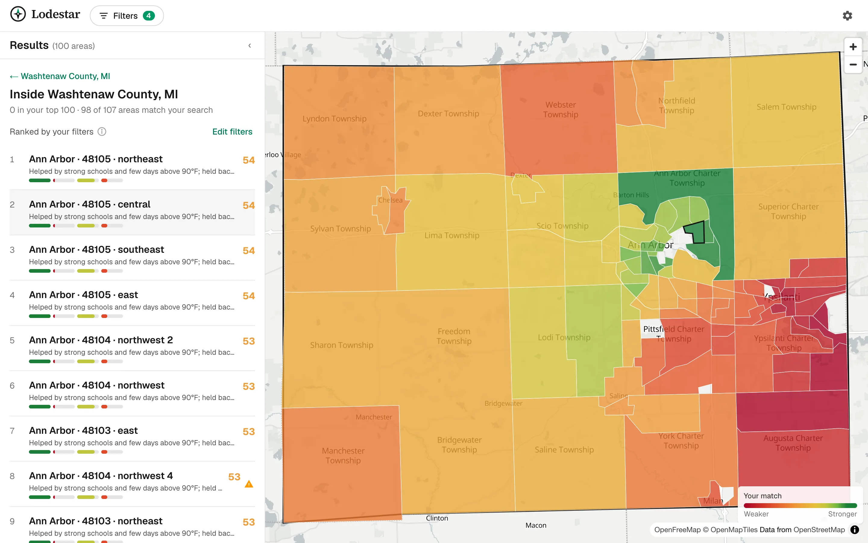
The map is built on MapLibre with OpenFreeMap tiles: a national view of your top matches, then a block-by-block choropleth inside any county. The whole search lives in the URL, so a copied link reproduces exactly what you see.
A Closer Look
Screenshots and feature sections from the live site.
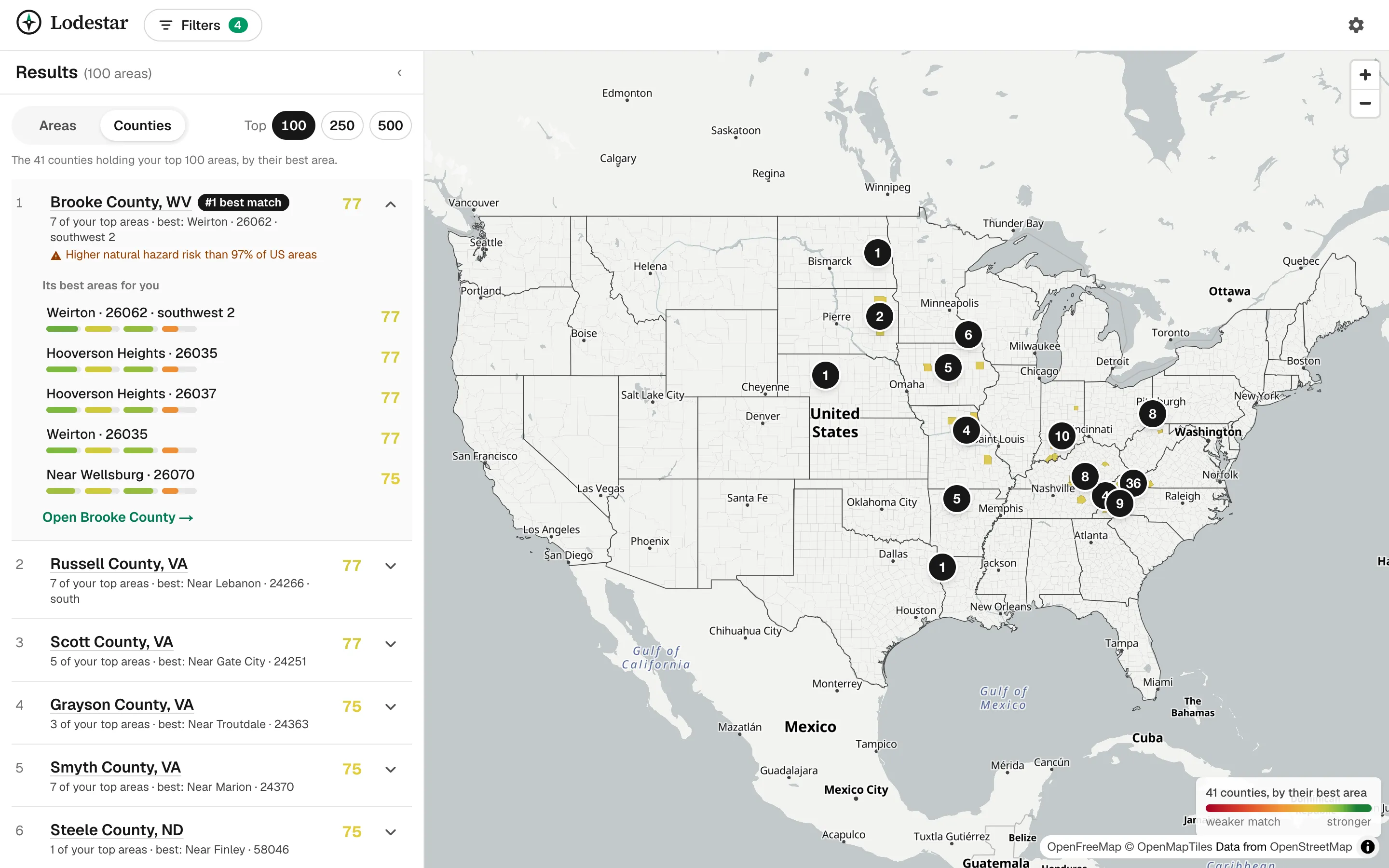
The national view: your top matches ranked by county, with clusters of top-matching areas on the map.
Design & Development Highlights
- Client-side scoring engine: percentile normalization, per-measure weights and direction, hard filters, and a breakdown of every score, all unit-tested in pure TypeScript
- No backend: the browser scores tens of thousands of areas over static files, so the app is fast, cheap to host, and works offline as an installable PWA
- Python ETL joining Census, BEA, NOAA, FEMA, BLS, Stanford SEDA, Zillow, and air-quality data at county and census-tract level
- Automated monthly data refreshes with GitHub Actions and Cloudflare R2, including state laws parsed from their cited sources and dated in the app
- MapLibre choropleth maps from the national view down to individual neighborhoods
- Shareable searches: filters, weights, and the open county all live in the URL
Services
- Web App Development
- Next.js & React Development
- Data Engineering (ETL)
- Interactive Maps & Data Visualization
Built with
- Next.js
- React
- TypeScript
- Tailwind CSS
- MapLibre
- Python
- pandas
- GitHub Actions
- Cloudflare R2
Want a site like this?
Tell us what you're building and we'll show you how we'd approach it — no pressure, no jargon.
Start a Conversation